Learning from the Master of Ink and Silence
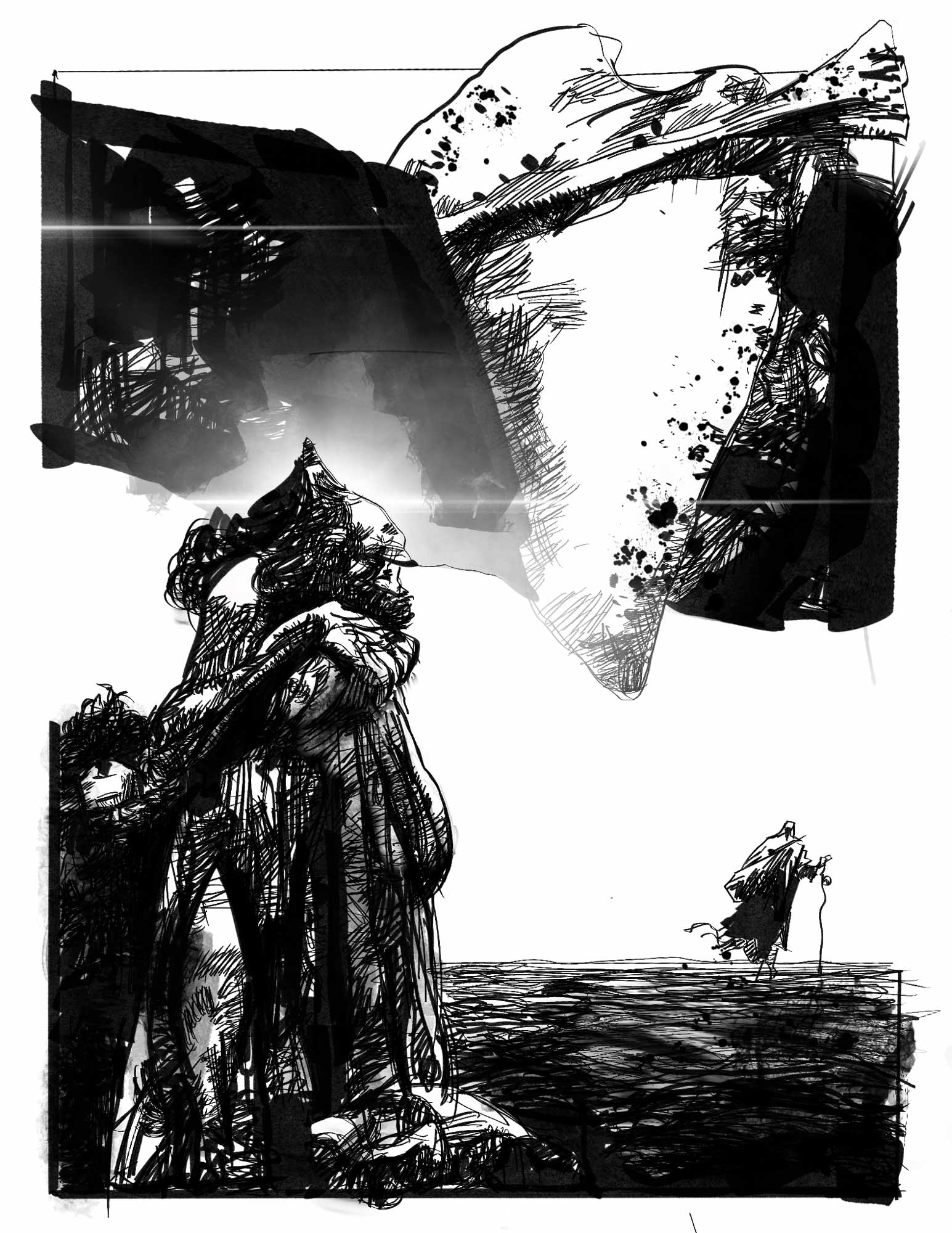
A close master study of Sergio Toppi’s work, recreated with respect to learn how his composition, scale, ink textures and use of negative space create such powerful visual storytelling.
This study explores how dramatic shapes, black-and-white contrast, and unusual framing can turn a drawing into something that feels like a legend or visual poem.
The challenge
The biggest challenge was not simply copying the image, but trying to understand why it works. Toppi’s compositions look loose and wild at first, but they are actually extremely controlled. Every black shape, empty area, small figure and detailed texture has a purpose.
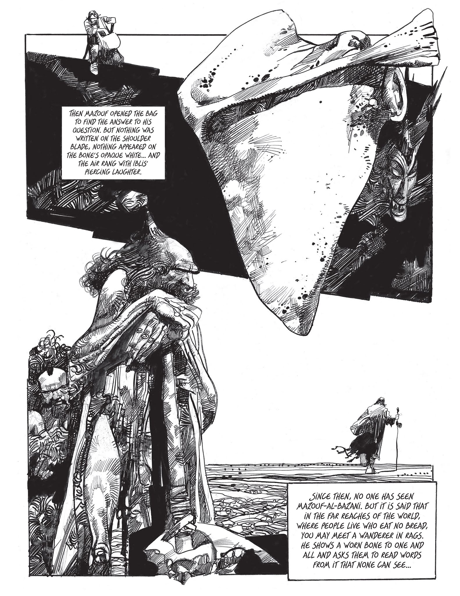

The solution
I approached the piece as a study of visual thinking. I paid attention to the balance between large shapes and tiny details, the way negative space guides the eye, and how ink can create atmosphere without relying on colour. Instead of only focusing on accuracy, I focused on learning how composition, contrast and silence can create storytelling power.


A close master study of Sergio Toppi’s work, recreated with respect to learn how his composition, scale, ink textures and use of negative space create such powerful visual storytelling.
